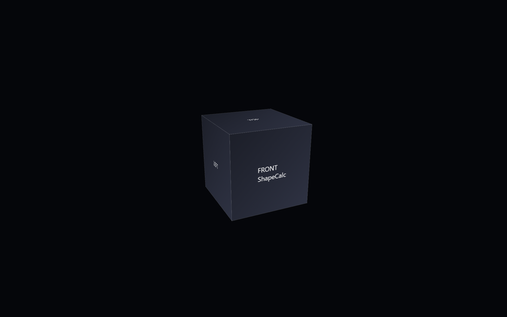
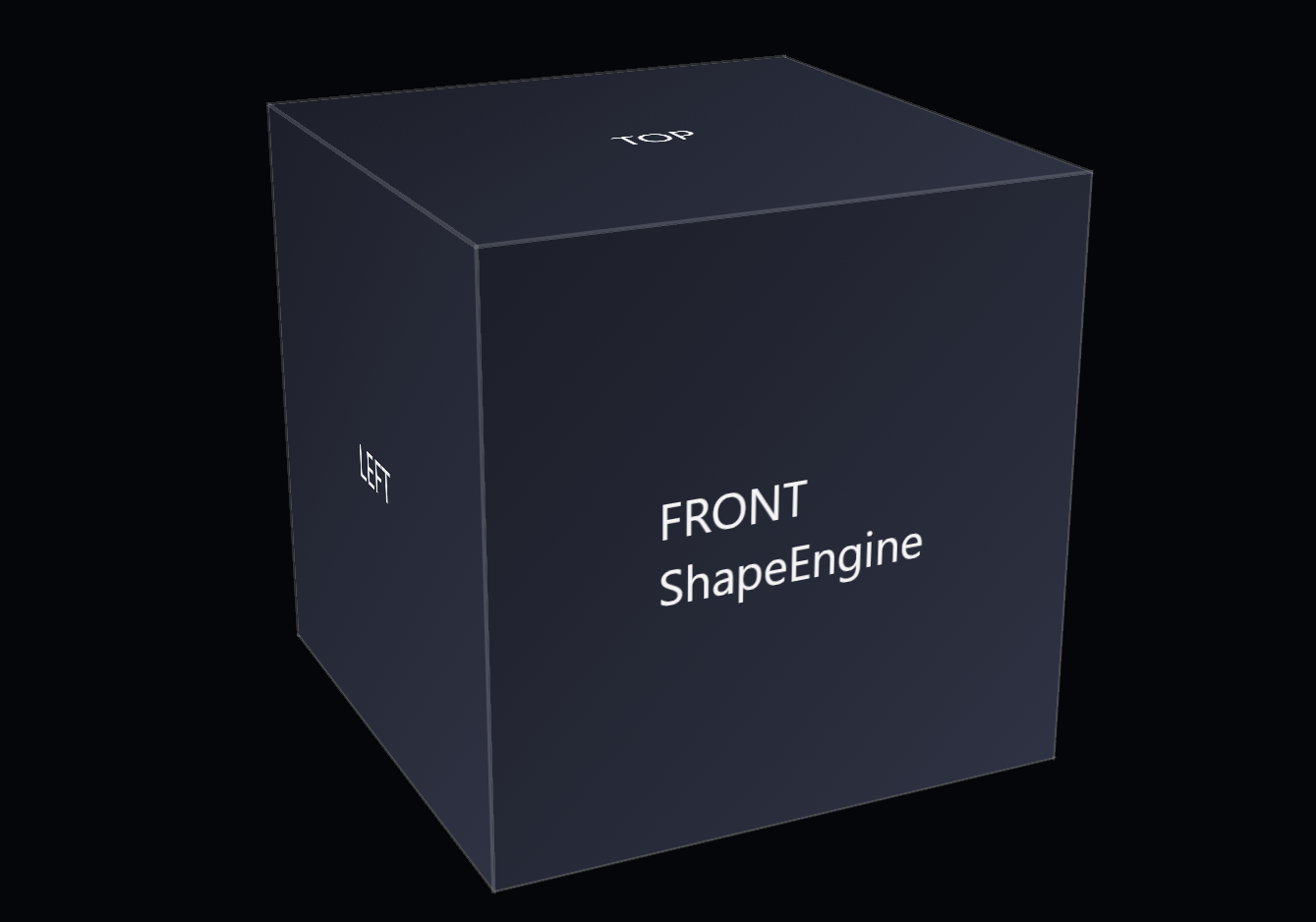
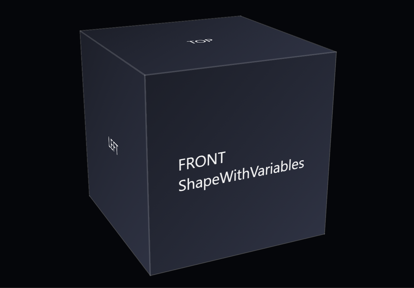
ShapeScope is the first step in Shape Pack 2 and the point where the shape becomes fully self‑contained. It builds on ShapeEngine by moving all custom properties and internal selectors into a top‑level @scope (.shape) block, turning the shape into a modular unit that no longer depends on global variables.

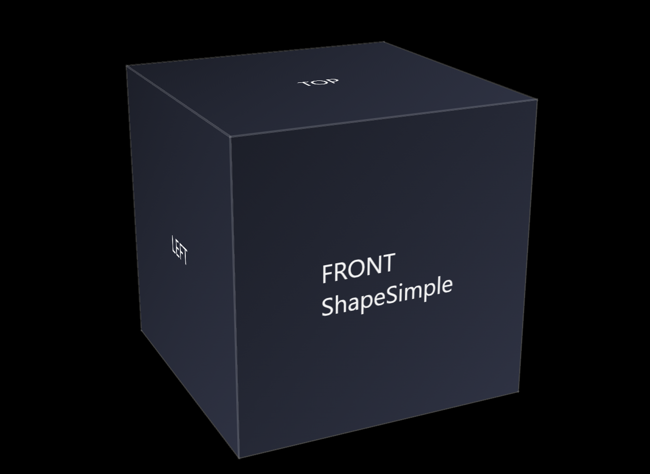
The following code snippet contains the base HTML for the CSS 3d shape.
<div class="scene">
        <div class="shape">
                <div class="shape__face shape__face--front">FRONT<br />ShapeScope</div>
                <div class="shape__face shape__face--left">LEFT</div>
                <div class="shape__face shape__face--back">BACK</div>
                <div class="shape__face shape__face--right">RIGHT</div>
                <div class="shape__face shape__face--top">TOP</div>
                <div class="shape__face shape__face--bottom">BOTTOM</div>
        </div>
</div>
The following code snippet contains the CSS for ShapeScope.
body
{
        margin: 0;
        min-height: 100vh;
        display: flex;
        align-items: center;
        justify-content: center;
        background: #05060a;
        color: #f5f5f5;
        font-family: system-ui, -apple-system, BlinkMacSystemFont, "SF Pro Text", "Segoe UI", sans-serif;
}

.scene
{
        width: 200px;
        height: 200px;
        perspective: 800px;
        perspective-origin: 50% 50%;
}

@scope (.shape)
{
        :scope
        {
                --shape-size: 200px;
                --shape-depth: 200px;
                --panel-count: 6;
                --panel-gap: 0px;

                --rotate-x: -20deg;
                --rotate-y: 25deg;
                --rotate-z: 0deg;

                --perspective: 800px;
                --perspective-origin-x: 50%;
                --perspective-origin-y: 50%;

                --animation-duration: 2000ms;
                --animation-easing: ease-in-out;

                --face-front-rotate: 0deg;
                --face-left-rotate: -90deg;
                --face-back-rotate: 180deg;
                --face-right-rotate: 90deg;
                --face-top-rotate: 90deg;
                --face-bottom-rotate: -90deg;


                position: relative;
                width: 100%;
                height: 100%;
                transform-style: preserve-3d;
                transform: rotateX(-20deg) rotateY(25deg) rotateZ(0deg);
                transition: transform 2000ms ease-in-out;
        }

        :scope .shape__face
        {
                position: absolute;
                width: 100%;
                height: 100%;
                display: flex;
                align-items: center;
                justify-content: center;
                background: linear-gradient(135deg, #1b1f2a, #2c3244);
                outline: 1px solid rgba(255, 255, 255, 0.15);
                box-sizing: border-box;
        }

        :scope .shape__face--front      { transform: rotateY(var(--face-front-rotate))  translateZ(calc(var(--shape-depth) / 2)); }
        :scope .shape__face--left       { transform: rotateY(var(--face-left-rotate))   translateZ(calc(var(--shape-depth) / 2)); }
        :scope .shape__face--back       { transform: rotateY(var(--face-back-rotate))   translateZ(calc(var(--shape-depth) / 2)); }
        :scope .shape__face--right      { transform: rotateY(var(--face-right-rotate))  translateZ(calc(var(--shape-depth) / 2)); }
        :scope .shape__face--top        { transform: rotateX(var(--face-top-rotate))    translateZ(calc(var(--shape-depth) / 2)); }
        :scope .shape__face--bottom     { transform: rotateX(var(--face-bottom-rotate)) translateZ(calc(var(--shape-depth) / 2)); }
}
The goal of this step is to shift the shape from a global pattern to an isolated, reusable component.
The folder includes:
- a CSS file with the entire shape wrapped inside a single
@scope (.shape)block - all former
:rootcustom properties moved into:scope, so they apply only to the component - updated selectors that ensure every face and transform is local to the
.shapeinstance - a short note describing what changed from ShapeEngine
What changed from the previous step
Change: Moved all custom properties and internal selectors into a scoped @scope (.shape) block.
Reason: To isolate the component from global variables and ensure every part of the shape is self‑contained and safe to reuse.
This step demonstrates how scoping can strengthen a component without altering its appearance or increasing its complexity. The cube renders identically, but its internal logic is now isolated and predictable. By completing the transition started in ShapeEngine and positioning ShapeScope as the opening step of Shape Pack 2, this step prepares the component for the additional capabilities introduced in ShapeCalc.