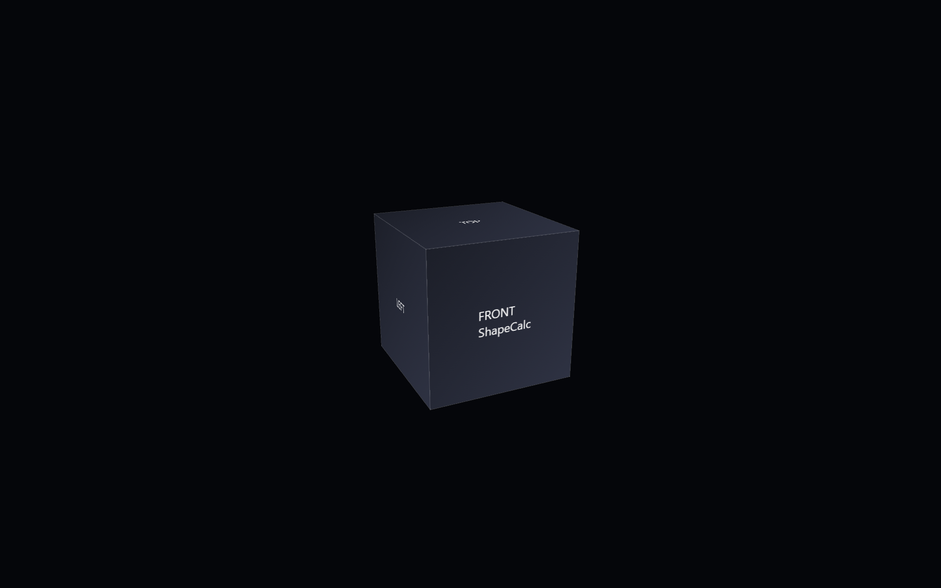
ShapeCalc is the next step in Shape Pack 2 and continues the shift from fixed to parameter‑driven geometry. It builds on ShapeScope by converting the pixel‑based translate-z custom property into a unit‑less numeric value, then re‑applying the pixel units in the transform using calc() to multiply the unit‑less number by 1px with calc(var(–translate-z) * 1px).

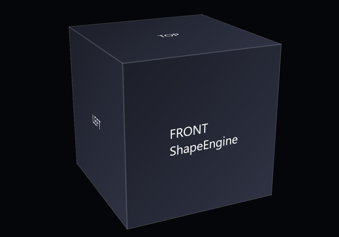
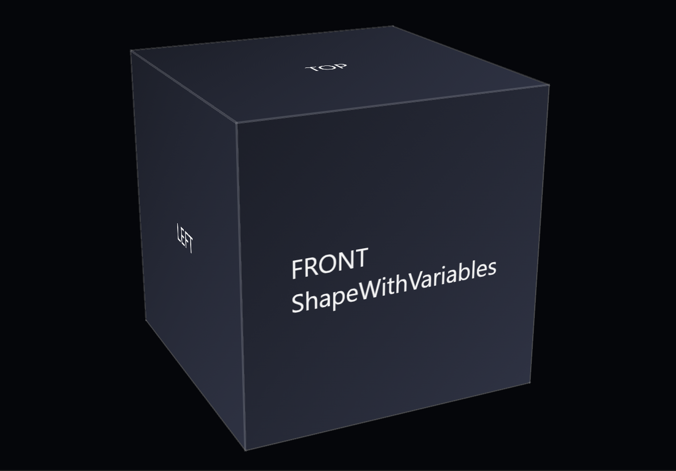
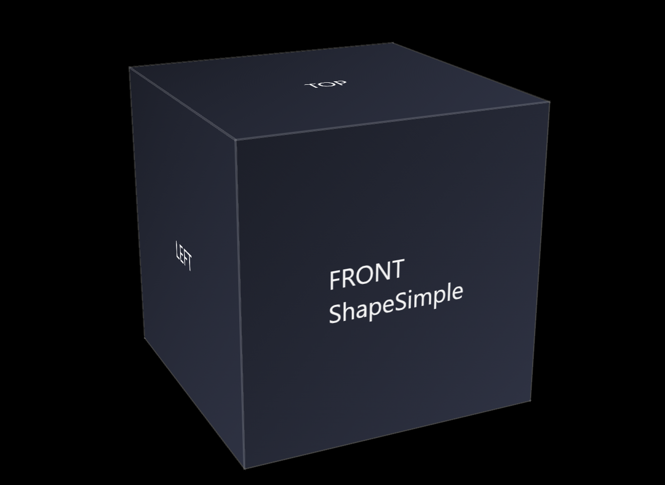
The following code snippet contains the base HTML for the CSS 3d shape.
<div class="scene">
        <div class="shape">
                <div class="shape__face shape__face--front">FRONT<br />ShapeCalc</div>
                <div class="shape__face shape__face--left">LEFT</div>
                <div class="shape__face shape__face--back">BACK</div>
                <div class="shape__face shape__face--right">RIGHT</div>
                <div class="shape__face shape__face--top">TOP</div>
                <div class="shape__face shape__face--bottom">BOTTOM</div>
        </div>
</div>
The code below shows the current CSS for the shape.
body
{
        margin: 0;
        min-height: 100vh;
        display: flex;
        align-items: center;
        justify-content: center;
        background: #05060a;
        color: #f5f5f5;
        font-family: system-ui, -apple-system, BlinkMacSystemFont, "SF Pro Text", "Segoe UI", sans-serif;
}

.scene
{
        width: 200px;
        height: 200px;
        perspective: 800px;
        perspective-origin: 50% 50%;
}

@scope (.shape)
{
        :scope
        {
                --total-degrees:360;
                --number-of-sides:4;
                --degrees-per-side:90;

                --translate-x:0px;
                --translate-y:0px;
                --translate-z:100;

                --shape-size: 200px;
                --shape-depth: 200px;
                --panel-gap: 0px;

                --rotate-x: -20deg;
                --rotate-y: 25deg;
                --rotate-z: 0deg;

                --perspective: 800px;
                --perspective-origin-x: 50%;
                --perspective-origin-y: 50%;

                --face-front-rotate: 0deg;
                --face-left-rotate: -90deg;
                --face-back-rotate: 180deg;
                --face-right-rotate: 90deg;
                --face-top-rotate: 90deg;
                --face-bottom-rotate: -90deg;

                position: relative;
                width: 100%;
                height: 100%;
                transform-style: preserve-3d;
                transform: rotateX(-20deg) rotateY(25deg) rotateZ(0deg);
        }

        :scope .shape__face
        {
                position: absolute;
                width: 100%;
                height: 100%;
                display: flex;
                align-items: center;
                justify-content: center;
                background: linear-gradient(135deg, #1b1f2a, #2c3244);
                outline: 1px solid rgba(255, 255, 255, 0.15);
                box-sizing: border-box;
        }

        :scope .shape__face--front      {  transform: rotateY(var(--face-front-rotate))  translateZ(calc(var(--translate-z) * 1px)); }
        :scope .shape__face--left       {  transform: rotateY(var(--face-left-rotate))   translateZ(calc(var(--translate-z) * 1px)); }
        :scope .shape__face--back       {  transform: rotateY(var(--face-back-rotate))   translateZ(calc(var(--translate-z) * 1px)); }
        :scope .shape__face--right      {  transform: rotateY(var(--face-right-rotate))  translateZ(calc(var(--translate-z) * 1px)); }
        :scope .shape__face--top        {  transform: rotateX(var(--face-top-rotate))    translateZ(calc(var(--translate-z) * 1px)); }
        :scope .shape__face--bottom     {  transform: rotateX(var(--face-bottom-rotate)) translateZ(calc(var(--translate-z) * 1px)); }
}
The goal of this step is to separate data from presentation, allowing the shape’s internal math to stay clean, scalable, and re-usable.
The folder includes:
- a CSS file showing the unit‑less variable pattern
- a custom property rewritten as a pure number instead of using a unit after the number
- updated transforms that applies units through
calc()at the moment of use
What changed from the previous step
Change: Converted the --translate-z custom property from a pixel value into a unit‑less number, then reapplied the pixel unit only at the moment of use through calc(var(--translate-z) * 1px).
Reason: To separate raw numeric values from presentation units, making the geometry easier to scale, compute with, and reuse in later components.
This step shows how geometry can become more flexible without changing the visual output. The cube still behaves the same, but some of its internal values are now mathematical rather than fixed. By removing units from the variable and restoring them only when needed, the shape becomes easier to scale, easier to compute with, and better prepared for future components that rely on dynamic geometry. This continues the progression from ShapeScope, places ShapeCalc within Shape Pack 2, and leads toward the upcoming ShapeFunction component.