ShapeWithVariables is the second step in the pack and the first moment where the shape gains a bit of structure. It takes the minimal form from SimpleShape and introduces a small set of CSS variables to make the component easier to adjust without changing the core rules.
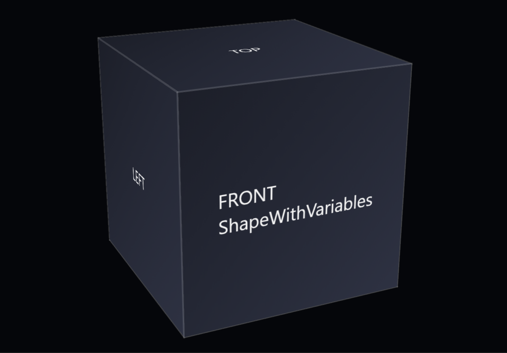
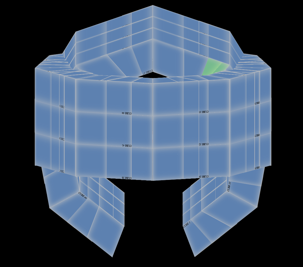
This example shows the base HTML for the CSS 3d shape.
<div class="scene">
        <div class="shape">
                <div class="shape__face shape__face--front">FRONT<br />ShapeWithVariables</div>
                <div class="shape__face shape__face--left">LEFT</div>
                <div class="shape__face shape__face--back">BACK</div>
                <div class="shape__face shape__face--right">RIGHT</div>
                <div class="shape__face shape__face--top">TOP</div>
                <div class="shape__face shape__face--bottom">BOTTOM</div>
        </div>
</div>
The example shows the new CSS for the CSS 3d shape.
:root
{
        --shape-size: 200px;
        --shape-depth: 200px;
        --panel-count: 6;
        --panel-gap: 0px;

        --rotate-x: -20deg;
        --rotate-y: 25deg;
        --rotate-z: 0deg;

        --perspective: 800px;
        --perspective-origin-x: 50%;
        --perspective-origin-y: 50%;

        --face-front-rotate: 0deg;
        --face-left-rotate: -90deg;
        --face-back-rotate: 180deg;
        --face-right-rotate: 90deg;
        --face-top-rotate: 90deg;
        --face-bottom-rotate: -90deg;
}

body
{
        margin: 0;
        min-height: 100vh;
        display: flex;
        align-items: center;
        justify-content: center;
        background: #05060a;
        color: #f5f5f5;
        font-family: system-ui, -apple-system, BlinkMacSystemFont, "SF Pro Text", "Segoe UI", sans-serif;
}

.scene
{
        width: 200px;
        height: 200px;
        perspective: 800px;
        perspective-origin: 50% 50%;
}

.shape
{
        position: relative;
        width: 100%;
        height: 100%;
        transform-style: preserve-3d;
        transform: rotateX(-20deg) rotateY(25deg) rotateZ(0deg);
}

.shape__face
{
        position: absolute;
        width: 100%;
        height: 100%;
        display: flex;
        align-items: center;
        justify-content: center;
        background: linear-gradient(135deg, #1b1f2a, #2c3244);
        outline: 1px solid rgba(255, 255, 255, 0.15);
        box-sizing: border-box;
}

.shape__face--front { transform: translateZ(100px); }
.shape__face--left { transform: rotateY(-90deg) translateZ(100px); }
.shape__face--back { transform: rotateY(180deg) translateZ(100px); }
.shape__face--right { transform: rotateY(90deg) translateZ(100px); }
.shape__face--top { transform: rotateX(90deg) translateZ(100px); }
.shape__face--bottom { transform: rotateX(-90deg) translateZ(100px); }
The goal of this step is flexibility. By moving key values—like size, color, or border thickness—into variables, the shape becomes easier to tune while still staying simple and readable. The component remains minimal, but now it has room to adapt.
The folder includes:
- an updated HTML file using the same basic structure
- a CSS file that adds CSS custom properties
- a short note describing what changed from ShapeSimple
What changed from the previous step.
- Change: Introduced a small set of CSS custom properties to eventually replace fixed values.
- Reason: Make the shape easier to adjust while keeping the component simple and readable.
This step shows how a shape can evolve without becoming complicated. CSS custom properties give you control, but the component stays small, direct, and easy to understand.