ShapeScope is the first step in Shape Pack 2 and the point where the shape becomes fully self‑contained. It builds on ShapeEngine by moving all custom properties and internal selectors into a top‑level @scope (.shape) block, turning the shape into a modular unit that no longer depends on global variables.
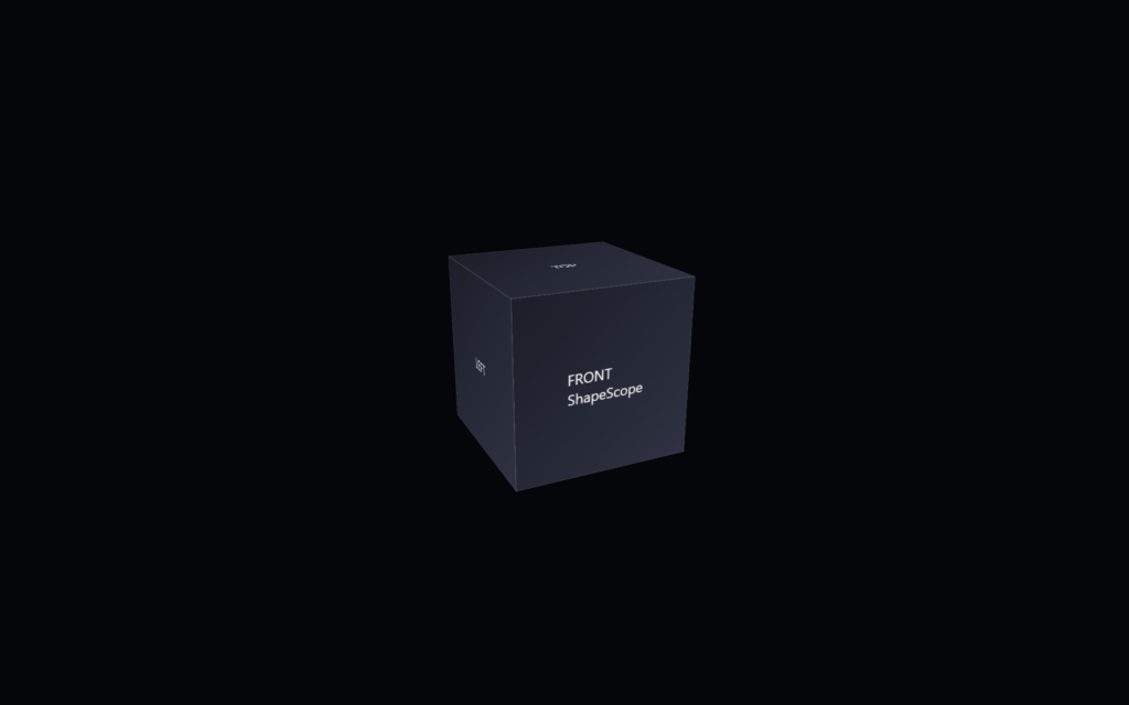
The following code snippet contains the base HTML for the CSS 3d shape.
<div class="scene">
        <div class="shape">
                <div class="shape__face shape__face--front">FRONT<br />ShapeScope</div>
                <div class="shape__face shape__face--left">LEFT</div>
                <div class="shape__face shape__face--back">BACK</div>
                <div class="shape__face shape__face--right">RIGHT</div>
                <div class="shape__face shape__face--top">TOP</div>
                <div class="shape__face shape__face--bottom">BOTTOM</div>
        </div>
</div>
The following code snippet contains the CSS for ShapeScope.
body
{
        margin: 0;
        min-height: 100vh;
        display: flex;
        align-items: center;
        justify-content: center;
        background: #05060a;
        color: #f5f5f5;
        font-family: system-ui, -apple-system, BlinkMacSystemFont, "SF Pro Text", "Segoe UI", sans-serif;
}

.scene
{
        width: 200px;
        height: 200px;
        perspective: 800px;
        perspective-origin: 50% 50%;
}

@scope (.shape)
{
        :scope
        {
                --shape-size: 200px;
                --shape-depth: 200px;
                --panel-count: 6;
                --panel-gap: 0px;

                --rotate-x: -20deg;
                --rotate-y: 25deg;
                --rotate-z: 0deg;

                --perspective: 800px;
                --perspective-origin-x: 50%;
                --perspective-origin-y: 50%;

                --animation-duration: 2000ms;
                --animation-easing: ease-in-out;

                --face-front-rotate: 0deg;
                --face-left-rotate: -90deg;
                --face-back-rotate: 180deg;
                --face-right-rotate: 90deg;
                --face-top-rotate: 90deg;
                --face-bottom-rotate: -90deg;


                position: relative;
                width: 100%;
                height: 100%;
                transform-style: preserve-3d;
                transform: rotateX(-20deg) rotateY(25deg) rotateZ(0deg);
                transition: transform 2000ms ease-in-out;
        }

        :scope .shape__face
        {
                position: absolute;
                width: 100%;
                height: 100%;
                display: flex;
                align-items: center;
                justify-content: center;
                background: linear-gradient(135deg, #1b1f2a, #2c3244);
                outline: 1px solid rgba(255, 255, 255, 0.15);
                box-sizing: border-box;
        }

        :scope .shape__face--front      { transform: rotateY(var(--face-front-rotate))  translateZ(calc(var(--shape-depth) / 2)); }
        :scope .shape__face--left       { transform: rotateY(var(--face-left-rotate))   translateZ(calc(var(--shape-depth) / 2)); }
        :scope .shape__face--back       { transform: rotateY(var(--face-back-rotate))   translateZ(calc(var(--shape-depth) / 2)); }
        :scope .shape__face--right      { transform: rotateY(var(--face-right-rotate))  translateZ(calc(var(--shape-depth) / 2)); }
        :scope .shape__face--top        { transform: rotateX(var(--face-top-rotate))    translateZ(calc(var(--shape-depth) / 2)); }
        :scope .shape__face--bottom     { transform: rotateX(var(--face-bottom-rotate)) translateZ(calc(var(--shape-depth) / 2)); }
}
The goal of this step is to convert the shape from a global pattern into an isolated, reusable component.
The folder includes:
- a CSS file with the entire shape wrapped inside a single @scope (.shape) block
- all former :root custom properties moved into :scope so they apply only to the component
- updated selectors that ensure every face and transform is local to the .shape instance
This step shows how modularity can evolve without changing the visual output or adding complexity. The cube behaves exactly the same, but its internal logic is now protected. By isolating variables and selectors, the shape becomes safer to reuse, easier to drop into larger projects, and more predictable when multiple shapes coexist.